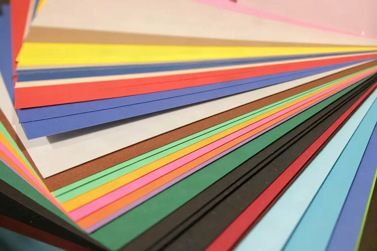
Walking into a frame shop can be a bit overwhelming. You stand in front of a design counter with a cherished artwork in your hands, only to be faced with a wall of over 150 different mat board colour samples. You start asking yourself the classic questions:
Will this cream look too yellow on my wall? Should I pick a bold blue to match that tiny paint stroke, or stick to clean white?
When choice paralysis kicks in, it’s easy to freeze. But choosing a mat board - the border of cardboard (note: we never recommend using actual cardboard) that sits between your art and the timber frame - doesn’t have to be a guessing game. In the picture framing world, the mat board is the ultimate stage manager. It shouldn't be the star of the show; its job is to quietly manage the stage so that your artwork can give a spectacular performance.
If you want to move past the guesswork, here is a simple guide to colour theory and professional design secrets that will help you pick the perfect mat board combination every time.
The Fine Art of Neutrals: White vs. Off-White vs. Cream
The vast majority of custom frames utilise neutral mat boards. However, choosing the wrong neutral is one of the most common design mistakes. If your mat board is brighter than the paper your artwork is printed on, it will "flatten" the piece and make your art look dirty, yellowed, or aged.
To get it right, you need to match the undertones of your art’s paper base to the right family of neutrals:
- Crystal White: This is a crisp, stark neutral. It works beautifully for modern digital photography, high-contrast black-and-white prints, and bold graphic design layouts. Avoid using it for vintage papers, older documents, or watercolours.
- Off-White, Eggshell, and Chalk Whites: These are the ultimate all-rounders. They carry a soft, muted warmth that doesn't pull focus. If your artwork is printed on a textured cotton rag or heavy art paper, an off-white mat will blend seamlessly with the print, creating a clean, borderless transition.
- Cream and Ivory: These mats carry rich, warm undertones. They are the historic standard for traditional oil paintings, antique maps, historical documents, certificates, and delicate watercolours.
The Accent Colour Trick: Find the Third Most Dominant Tone
If you want to step away from pure neutrals and inject some colour into your framing design, there is a golden rule to prevent the framing from dominating the art.
Most people instinctively look at a picture and match the mat board to the most dominant colour. For example, if they have a landscape with a massive blue sky, they choose a massive blue mat board. Don't do this. Matching the dominant colour chokes the artwork and traps it inside a monolithic block of a single shade.
Instead, use the professional design secret; Find the third most dominant colour in the piece.
Look closely at the details. Is there a tiny streak of gold hidden in a field? A flash of crimson in a subject’s clothing? A subtle emerald green in the shadows of a tree? By picking that minor, supporting colour for your mat board, you draw the viewer's eye deep into the artwork, highlighting hidden layers that would otherwise go completely unnoticed.
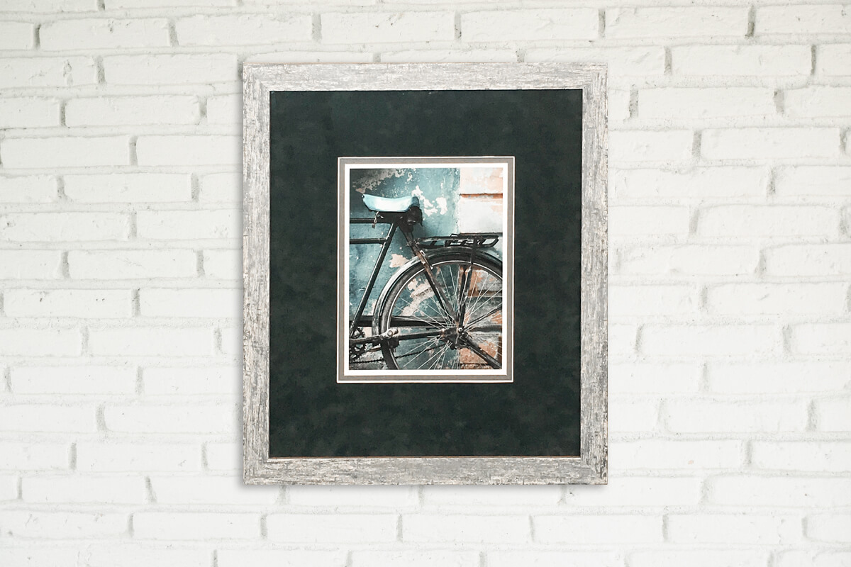
If you are looking for a mat board offering a stylish flair such as a Designer Suede, Kobi Silk or Real Linen then check out our designer matboard collection.
Mastering Double Matting: Adding Architectural Depth
If you want a truly premium, three-dimensional gallery look, you can layer two mat boards on top of one another. This is known as a double mat, and it creates a beautifully crisp border around your art.
To keep it elegant, follow the anatomy of a classic double mat:
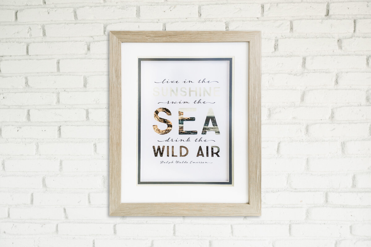
- The top mat: This should remain your classic, wider neutral (like a soft Off-White, Warm White, or Linen). It acts as a visual palette cleanser, giving the eye a clean place to rest as it transitions from your room's wall to the artwork.
- The bottom mat: This sits underneath the top mat, showing just a tiny, narrow 5mm reveal or accent. This is where you introduce your bold, rich colour.
The result? You get a brilliant pop of team colour for a sports jersey, or a sliver of metallic gold for a university degree, without overpowering the entire display.
Dark vs. Light Mats: Changing the Mood of Your Room
Colour selection isn’t just about matching the art; it's about controlling how human eyes perceive space and depth. You can dramatically change the visual impact of a piece simply by choosing between a light or a dark colour palette.
Light Mat Boards
Light mats expand the artwork outward. They pull space and light into the frame, making the entire piece feel expansive, light, and fresh. If you are decorating a smaller room, or trying to achieve a clean, coastal, or Scandi interior design, light matting is your best friend.
Dark Mat Boards
Dark mats (Charcoal, Navy, Black) act like a camera shutter - they pull the viewer's eyes sharply inward, focusing all human attention entirely on the art. Dark mats create instant drama, contrast, and weight. They are an exceptional choice for moodier living spaces, home theatres, or for isolating bright, neon, or metallic elements in modern pop art.
Bevel Cuts: White Core vs. Black Core
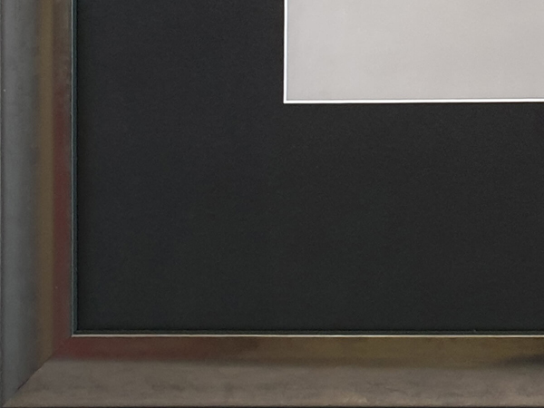
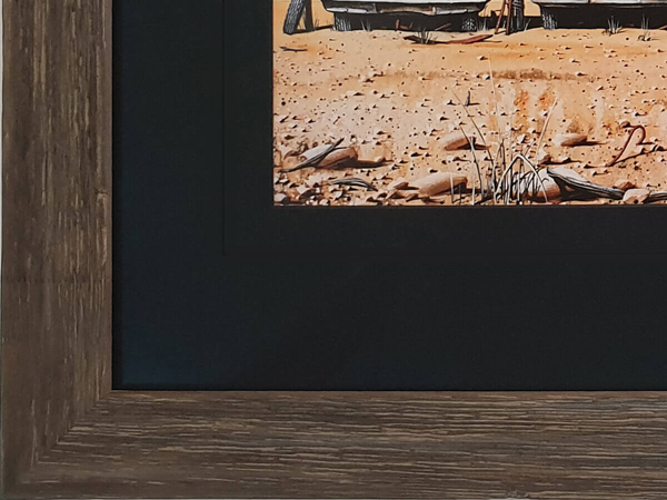
When a custom framer cuts the window opening into a mat board using a computerised or hand mat cutter, they cut it at a precise 45-degree angle. This angle creates a bevelled edge that reveals the inside core material of the mat board.
Tip: Choose a framer that uses a computerised mat cutter to eliminate unsightly overcuts.
You have two primary options here, and they act like subtle makeup for your art:
- White Core Mats: This is the industry standard. When cut, it leaves a crisp, thin white line right around the edge of your artwork. It acts as a clean border that separates the art from the mat colour.
- Black Core Mats: These mats are manufactured with a solid black interior. When cut, they leave a dramatic, dark outline around the artwork. It mimics the look of a fine-liner artist pen, adding an extra layer of definition and geometric structure to sketches, maps, and photographs.
White Core mat board bevel |
Black Core mat board bevel |
The Budget Luxury Hack: Adding a V-Groove
What if you want the high-end, multi-layered look of a double mat, but you want to keep your project highly cost-effective? Enter the V-groove.
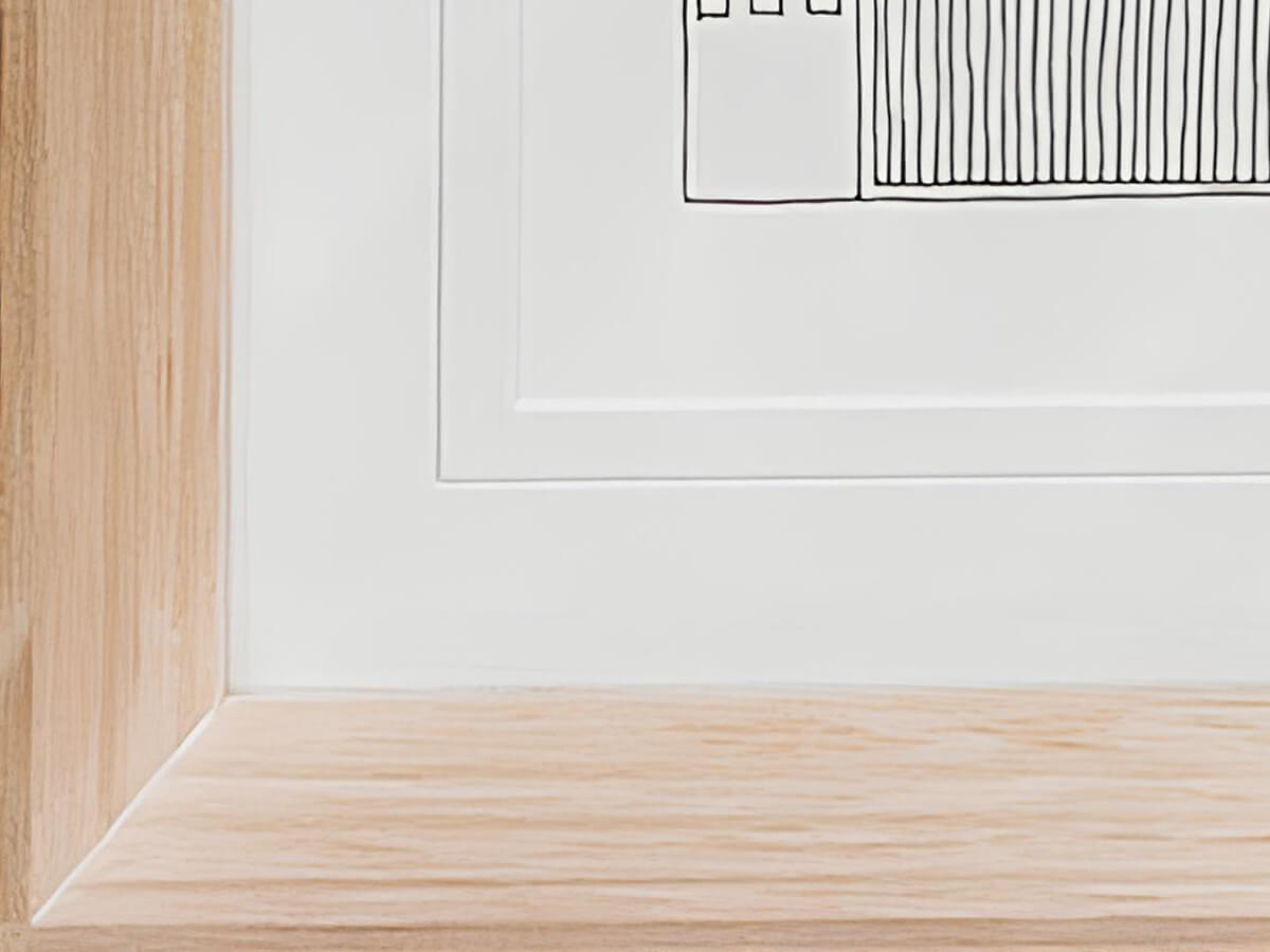
A V-groove is a thin, shallow line carved directly into the top surface of a mat board, usually about 5mm to 10mm outside the main window opening. Because our computerised mat cutters can cut this line with mathematical precision in a matter of seconds, it only incurrs a small charge and doesn't require the extra materials of a physical second mat layer.
Why a V-Groove is a Game-Changer:
- The multi-mat illusion: It breaks up flat, empty space on a wide mat board, giving the visual illusion of an expensive, layered double mat while utilising just a single mat board.
- Exposing the core contrast: Because the blade slices a small 'V' into the surface, it reveals the inner core colour of the board. For example, if you choose a charcoal mat board with a white core, the V-groove will show up as a beautiful, bright geometric pin-stripe that frames your photo perfectly.
- Traditional museum elegance: V-grooves beautifully mimic the traditional, hand-ruled ink lines used by high-end, classical European art conservators. It instantly gives university degrees, family heirlooms, and landscape photography a stately, sophisticated finish on a friendly budget.
Bring Your Art to Life
At the end of the day, digital screens can alter colour tones, shifting how creams, whites, and accent colours truly look in real life. The absolute best way to ensure your mat board matches perfectly is to see it under true lighting.
If you have a piece of art, a vintage print, or a sentimental memory ready for the wall, bring it into your nearest Frame Today store. Our qualified, picture-framing consultants will lay your artwork down on the design counter, pull out real Peterboro museum-grade mat samples, and help you play with colours, layers, and V-grooves until your artwork looks exactly the way it deserves to.